Introduction
One of the most important actions a prospect can take to become a sales qualified lead (SQL) is to sign up for a 1-on-1 demo of your software. And yet, your Request a Demo form might actually be hindering the process. Awkward design, poor or missing content, and even the colors you choose can all have a powerful impact on whether or not your prospects end up speaking to you.

Here are three easy ways to leverage your demo form to increase conversions:
1. Use Enriched Data to Reduce Fields in Real-Time
We have all seen sign-up forms that ask more questions than the IRS during an audit. Name, phone number, email, industry, number of employees, annual revenue, the CEO’s blood type—on and on forever. But how many questions do you actually need to ask your prospect to begin the initial qualification process?
Less is more when it comes to the number of fields on your demo form. In the case of Imagescape, by reducing their contact form from 11 to 4 fields, they saw an incredible 120% increase in conversions.
And even micro-shifts in your number of fields can help. A study by Hubspot shows that reducing your form from four to three questions can have a dramatic effect on your conversion rates.
“But we need to have all of these data points to qualify our prospects!” you might be thinking. Not to worry, diligent marketer. This is where the power of data enrichment comes into play. What if, instead of asking your prospect, you already knew the answers to these important questions?
Lusha’s data enrichment allows you the opportunity to collect a significant amount of information from your customer automatically.
2. Use Conversion Rate Optimization Best Practices
Beyond the number of fields in the form, you have plenty of options for adjusting elements to make your demo page more conversion-friendly. While it can seem overwhelming, Conversion Rate Optimization (CRO) ultimately boils down to understanding your customers and delivering the right website experience to further their buying journey.
It’s easy to overlook CRO best practices on a demo form versus a homepage. Homepages are complex, public-facing pages that need to convey your unique selling proposition. And a demo form is just a simple submission page—there’s nothing to think about there, right? Wrong.
While a demo form may have fewer elements than your other site pages, it is absolutely critical to A/B test content and design choices. Your conversions may just depend on it. Thankfully, tools such as VWO make it very easy to test all of your page elements to make data-driven decisions and reduce friction in the sign-up process.
We could spend an entire blog series on various CRO best practices, so we will limit this section to some of the most impactful elements to test.
Social Proof
Social proof is one of the most powerful weapons in your arsenal for converting a prospect into a customer. Why? Because if customers already love your product, your prospects can
Social proof can take many forms on your demo page, including:
- Trust icons (i.e. logos of big companies you work with)
- Number of customers served
- Case studies
- Reviews
- Social media posts
- Testimonials
Video
A picture is worth a thousand words, as the old saying goes. So how many words is a video worth? The answer may surprise you. Not only can video help drive customers to a demo, but video can help completely transform the sales process.

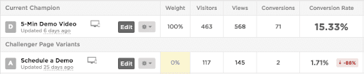
Source: CrazyEgg.com
A 15.33% conversion rate vs 1.71% for booking a call—an almost 9x difference! And even more astounding is that they found their leads were still qualified and that the video shortened the sales cycle, since the customers had become pre-sold on the product before ever speaking to a rep.
It is important to note that video, like any other conversion element, is something you should test for your specific product and target market.
Colors
Marketers in all industries know the importance of color in conveying a brand identity.
Your page’s color scheme has a dramatic impact on how prospects perceive your company. Is your brand youthful and energetic? Professional and conservative? It all depends on the color choices you make.
The color of even the tiniest elements on your page can influence your conversions. Performable — an email marketing platform acquired by HubSpot—boosted conversions by an astounding 21% by changing the Call To Action button from green to red.
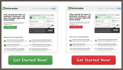
Source: Quicksprout.com
Call To Action
The color isn’t the only thing you can test on your Call To Action (CTA) button. “Submit” is one of the most common CTA on demo forms, but it’s also one of the worst. With your CTA button, you have a terrific opportunity to set the tone for a positive and welcoming customer experience.
3. Test Multi-Step Forms
Another worthwhile practice is to alter the demo signup experience altogether. If you’ve pared down your questions and done your CRO, you can also test breaking up your forms into a multi-step process. Each page represents a micro-commitment on the part of your prospect, which can yield incredible results.
Let’s explore how Evergage changed their signup process.
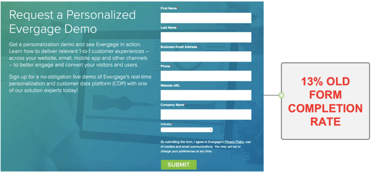
Source: Evergage.com
What mistakes can we see in this original form?
- Lots of unnecessary body copy. (A good rule: If you can delete copy and have the page still make sense, you probably should.)
- 7 form fields on a single page
- The dreaded “Submit” CTA
Now let’s take a look at the new, multi-step experience:
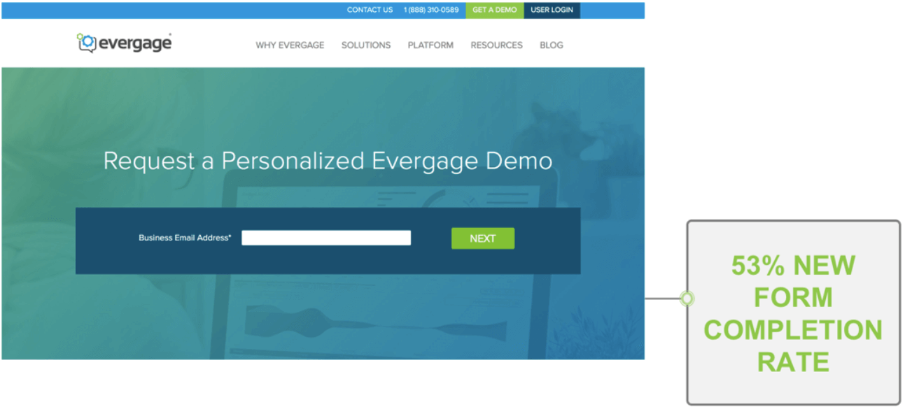
Source: Evergage.com
Wow! A whopping 53% conversion on the first page. Note the lack of body copy, the single field (business email), and updating the CTA to the more pleasant-sounding “Next”.
What’s incredibly clever about this approach is that even if the prospects drop off after step 1, Evergage will be able to not only enrich the data, but also set up a nurturing sequence to still push the prospect to the demo.
Now let’s take a look at the next step:
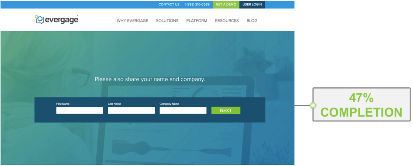
Source: Evergage.com
47% completion. Not too shabby! Now we have the prospect’s first name, last name, and company name.
And finally, we get to the third and final step:
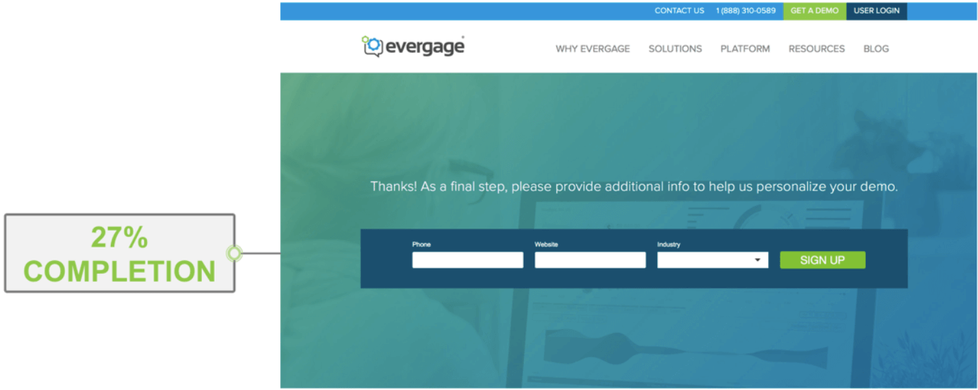
Source: Evergage.com
The drop off to 27% is fairly steep, but fortunately, these fields aren’t super-necessary to booking an appointment. If necessary, the sales rep can even manually find the additional information using a data enrichment Chrome plugin.
Note that Evergage didn’t reduce the number of fields at all—the multi-step sequence still asks 7 questions. And what’s especially impressive is that the worst-performing page of this new opt-in experience is still 2x the conversion rate of the original form.
Key Takeaways
Your Request A Demo form is one of the most important tools in converting a prospect into a buyer. By optimizing your form, you have an incredible opportunity to boost your conversions and ultimately, your sales. Your perfect demo form will depend upon your ideal customer profile, your industry, and your sales process. Here are some excellent tactics to explore:
- Data enrichment can reduce friction by eliminating unnecessary fields from your forms.
- A/B test elements on your page using Conversion Rate Optimization best practices.
- Consider multi-step forms to enhance the sign-up experience.
Looking to improve your conversion rates with enriched data? Check out Lusha today!