In order to nudge a prospect into your sales funnel and convert them into a lead, you will inevitably reach a point when you need to collect their information.
The question is, What’s the best way to do that? And the answer is surprisingly simple: lead generation forms.
Think of a lead generation form as a digital questionnaire that ask the prospect to submit their information to your company.
They come in all styles and sizes, from a simple email collection box to multi-paged, super-detailed documents that may as well be from the U.S. Census Office.
Not all lead generation forms are created equal—not by a long shot. In order to maximize the number of leads generated, you’ll need to implement high-converting forms that capture a good percentage of the prospects who see it.
We’re going to show you our top 10 best converting lead generation forms. But before we do, let’s quickly run through what works best and why.

What’s a Lead Generation Form?
A lead generation form is exactly what it sounds like: a form that allows companies to generate leads. Most forms do this by asking for an email address in exchange for something of value such as a free ebook, trial of a product, or frequent newsletter updates.
What Fields Should Your Lead Generation Form Have?
Some B2B lead generation strategies need forms are incredibly simple and only ask website visitors to fill in a single field, maybe two. Others are quite extensive and ask for heaps of information. Which approach should your company take as it moves into the new year?
The short answer is: it depends…
The fewer details you ask your website visitors to surrender, the more leads you’ll generate. But that’s not the end of the story. If a website visitor is willing to fill in 12 fields worth of personal information, they’re subconsciously signally their immense interest in your company and it’s offerings. Which means that this visitor is probably a very high-quality lead.
How many fields your lead generation forms should have really comes down to your B2B lead generation process. Do you want quality or quantity?
Whatever your answer is, we recommend including the two fields below. Why two? Because two fields has been proven to be the most effective number, according to CrazyEgg.
It should be noted, though, that the kind of lead generation form matters. For example, most people will fill out additional form fields when entering a contest, but not when responding to standard contact forms.
Name
The name of the person filling in your lead generation forms isn’t vital information. You should be perfectly capable of communicating and building relationships with them no matter what they call themselves. But being able to address your new leads in a personalized way is valuable.
It will allow you to interact with them on an individualized basis, thus building trust between you and them. You’ve heard it before, people buy from businesses they know, like, and trust.
Email Address
While the name field is optional, the email field is not. It’s pretty obvious, if you don’t get this crucial piece of information from your website visitors, you won’t be able to communicate with them — which is the entire point of generating leads.
Once you have their email address, it can be added to your company’s database. While you’ll want to operate with care (there are strict laws in regards to email marketing), this person can then be sent useful information and marketing messages at a later date — a viable strategy since email marketing produces an average ROI of 4,400% in the U.S!
What Fields Should Your Website Contact Forms NOT Have?
Just as there are fields that your contact forms should have, there are also fields that should be avoided. Obviously, there are exceptions to every rule. But in general, we advise against using address, company, and phone number fields in your website contact forms. Let us explain why:
Address
A person’s physical address is a pretty personal piece of information — much more personal that their name, email address, or phone number. Forcing website visitors to give it up is a surefire way to lower your conversion rate, both now and in the coming year.
The thing is, in most cases, an address isn’t even relevant to the company asking for it. Unless you work in real estate or some other industry where the physical location of your leads is paramount, we suggest leaving this field off your lead generation forms.
Phone Number
Research shows that lead generation forms that include mandatory phone numbers fields can reduce conversion rates by up to 52%. That’s a huge drop!
A phone call is a more personal form of communication than an email and many folks are hesitant to give companies access to themselves in that kind of way. If you’re intent on including a phone number field on your lead generation form, we at least suggest making it optional.
Company
Knowing what companies your website visitors work for is valuable. It will tell you which industries your organization’s products are used in and give you something to brag about, i.e. “Our solutions are used by (insert totally amazing company)!”
So why do we suggest not including a “Company” field in your lead generation forms? Because more fields reduce conversion rates and you can easily learn this information in a different way.
Honestly, anything more than the two fields mentioned in the section above is probably overkilling and will shrink your conversion rate. So unless you absolutely need more information, we recommend keeping your lead generation forms as simple as possible.
What makes a lead generation form exceptionally effective?
1. Short lead generation forms are more effective than long ones.
Imagine you find a stranger on your doorstep who wants you to sign a neighbourhood petition. Their goal is to collect your contact information—the more the better, but ultimately, they need your email address.
Let’s be generous and say that you do support their petition. Which introduction is more appealing and which would lead you to shut the door in their face?
Hello! I’m collecting signatures for a neighbourhood petition…
- …Can you please give me your email address so I can add you to it?
- …Can you please tell me your first and last name, date of birth, email address, phone number, business name, business type, business size, and top three interests so I can add you to it?
The answer seems pretty obvious, right? Simpler, shorter forms generate a much higher conversion rate than longer, more detailed ones. And yet, you’d be shocked how many lead generation forms bombard casual website visitors with option B.
Remember what they say when writing essays in middle school: KISS. Keep It Simple, Silly!

2. Use data enrichment to expand upon information collected through short lead generation forms.
Next to simply not knowing any better, one of the top reasons why businesses ask for a ton of information on their lead generation forms is because they think that they need it.
For example, you may think, “But I need their first name so that I can customize their emails. After all, emails with first names convert X% greater than those without.” Or, you may worry, “Without knowing more about their business, I can’t accurately score the lead!”
Which are both excellent points! However, you don’t necessarily need to ask for this information to acquire it. Enter: data-enrichment tools.
Data enrichment tools take what little information you have and crawl different online databases to fill in the gaps. With more information you can be more effective at:
- Lead Scoring: How much is this lead potentially worth to your company?
- Segmentation: Which other leads or accounts resemble this one?
- Lead Nurturing: What’s the best way to move this lead through your sales funnel?
And, you can also enjoy the added benefit of a better brand image, since leads will feel as though your conversations with them are custom-tailored to their needs.
It’s important to remember to follow best practices when using data enrichment! Especially with the introduction of GDPR, the rules are more stringent on what information you can acquire and store regarding a lead. However, if you choose your tools carefully and always respect your prospects, you won’t run into many challenges here!
3. Choose the data enrichment method that works best for you.
At this point, you may see the value in using data enrichment to keep your lead generation forms short without missing out on any essential data about your leads. But how do you actually enrich the data?
There are three primary methods: manual, real-time, and post-submission.
Manual Data Enrichment
Manual data enrichment, or “brute force” data enrichment, means that somebody must take the time to do research on every lead that comes through. They may run the email through LinkedIn, browse social media profiles, scour Google—whatever methods they choose—and meticulously add information about each lead to a spreadsheet by hand.
Advantages: You can get more creative and make leaps that our machine learning and AI tools haven’t learned yet. For example, if an email address is [email protected], you may know to look for Bob Smith and Robert Smith.
Disadvantages: It’s easy to miss important information about a lead. Enriching a lead manually is also very time-consuming, which increases costs.
Real-Time Data Enrichment
Real-time data enrichment means that a lead’s data is being verified and enhanced as they use the lead generation form. To do real-time data enrichment, you would use a data enrichment specialist’s forms to collect your data.
Advantages: You can verify the information immediately.
Disadvantages: Some users may prefer to use their current CRM’s forms. Additionally, switching to a new form provider will require the user to manually change all of the forms on their website, which can be a tedious process.
Post-Submission Data Enrichment
Post-submission data enrichment means that a lead’s data is sent from a form to a CRM, and then inside of the CRM, an application will enhance the data. For example, Lusha for Salesforce will automatically enrich the data collected through the CRM.
Advantages: With this lead generation tool you can keep using your favorite CRM and explicitly define the criteria for the enrichment records.
Disadvantages: You can’t verify information in real-time, and you’ll need to make sure that the CRM you use integrates with the data enrichment tool that you would like to use.
Optimize Your Lead Generation Forms for Greater Success
Now that we know which fields to include in our lead generation forms and which to avoid, let’s talk about a few other ways to optimize our forms for conversions in 2020.
Form Placement Matters
It’s true, where your form is located on your company’s website can have a dramatic effect on the conversion rate. In most cases, placing your form above the fold (i.e. in a section of your website that can be seen without scrolling down) is the best option.
According to Nielsen Group, the average difference in how website users treat information above and below the fold is 84% (in favor of above the fold) regardless of screen size. That’s quite a difference and goes to show you that form placement is vital to your company’s ability to generate leads at a consistent clip.
Prioritize Ease of Use
Your lead generation form needs to be the definition of simplicity. If it’s not and your website visitors have to fill in 14 different fields, squint to read important information, or go through seven different steps in order to complete your form, they won’t. Instead, they’ll abandon your form faster than you can say “Jack Robinson” and you’ll have lost a lead.
Don’t let this happen! Instead, always keep your potential leads and their comfort at the forefront of your mind. If you think an aspect of your lead generation form might compromise their experience on your website in any way, change it.
Direct Attention
This lead generation form optimization tip is closely related to our last one but deserves its own section. One way you can both draw attention to your forms and make them easier to fill out is to use directional cues to signal to web users what you want them to pay attention to.
You can do this by including arrows in your lead generation forms or pictures of people looking in a specific direction.
Use Contrasting Colors
Another way to make sure your lead generation forms stand to grab attention in the new year is to create them using contrasting colors. For example, if your website background is white, make your form red, orange, or a similarly bright and eye-catching color. That way your potential leads won’t miss it.
Just make sure that you choose the right color. The folks at WebpageFX tell us that people make subconscious judgments about the websites they visit in just 90 seconds. And 62 – 90% of said judgments are based on color alone.
So how do you choose the right colors for your lead generation form? There’s a lot that goes into color theory, but we’ll simplify it for you. Make sure your form colors:
- Reflect your company and its brand
- Match the other colors on your site
- Stand out from the rest of your site
Follow those three tips and you should be good to go!
Create a Killer CTA
Your lead generation form’s CTA is arguably its most important element. A subpar CTA will sink your conversion rate faster than just about anything else, aside from the number of forms you require website visitors to fill in.
Fortunately, there are a few strategies you can use to make sure the CTA on your lead generation form is top notch:
- Be Direct: Your potential leads shouldn’t have to guess what they’ll get once they click your CTA. For instance, “Download Whitepaper” makes it clear that once clicked, a new lead will have the opportunity to download a whitepaper.
- Stress Benefits: CTAs like “Submit” don’t perform well. One of the reasons why is because they don’t showcase benefits. “Get Your Ebook Now” on the other hand tells potential leads exactly how they’ll benefit from clicking.
- Keep Design In Mind: As a marketer, one of your biggest challenges is grabbing the attention of your audience. That’s why we suggest making your CTA buttons a different color than the rest of your lead generation form so that they’re easy to see.
Here’s an excellent CTA example:
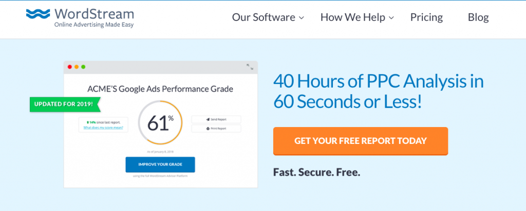
Source: wordstream.com
Test Your Forms
Finally, to really ensure your lead generation forms are the best they can be, you need to test them. The easiest way to do that is to run what’s known as an A/B test.
If you’re not familiar with the term, an A/B test in regard to lead generation forms is when two alternative forms are created and tested against each other to see which performs best. The trick is to only make one change per test. For example, you could create nearly identical forms, only varying the CTA. After splitting traffic to both, the CTA that secures the most lead wins.
Nobody gets it perfect on the first try — not even well-known marketing companies like Marketo. A few years ago, the software maker tested its lead generation forms and was able to reduce its cost per lead by an astounding $10.66!
Power Your Lead Generation Forms With Automation
Now that we’ve covered how to build a lead generation form that converts at a high level, let’s talk about the secret sauce of your lead gen efforts: automation. There are many different ways you can introduce automation into your marketing workflow. Here are two ideas:
- CRM Organization: As soon as a new lead fills out your lead generation form, their contact details should be automatically added to your CRM of choice. This is easily done with automation, either through a native integration or via a tool like Zapier, depending on the software programs you use.
- Email Marketing: You can also use automation to fuel your email marketing efforts. Once a new lead gives you their email address, you can have your chosen email provider send a pre-written welcome message or series. This will allow you to introduce new leads to your company on autopilot.
- Increase your response times: Speed to lead is a critical factor in sales success. The faster you can connect with prospects, the more likely you are to convert them into customers. But speed is about more than just making a quick call or sending a quick email. It’s about being able to move efficiently through the entire sales process, from initial contact to close. Focus on building relationships with decision-makers. The faster you can build trust and rapport, the faster you can move through the sales process.
Automation will save you and your marketing time loads of time. It will also ensure that nothing falls through the cracks and each of your new leads receives a quality experience. We encourage you to take advantage of this technology moving forward!
Supercharge Your Lead Generation Form With These Tools
At this point, you know which fields to include and which to remove from your lead generation form. You also know how to optimize your form for greater success and power it with automation. What’s next?
The only thing left is to supercharge your lead generation form with the following three software tools. Each has been chosen for a specific reason. Here’s why:
JotForm
JotForm makes it incredibly easy to create online lead generation forms. It’s easy to use and will allow you to quickly design professional forms that match your company’s unique branding. It also integrates seamlessly with many popular tools like WordPress, HubSpot, and MailChimp.
Chili Piper

Source: ChiliPiper.com
Chili Piper is a handy app that will allow users to book a meeting with a company directly after filling out a lead generation form on its site. It’s the perfect tool for forms that offer free product trials, assessments, etc. and can quickly shorten sales cycles. Just like JotForm, Chili Piper has a solid list of integrations that include HubSpot, Salesforce, and Zoom.
How to Create a Lead Capture Form that Doubles Conversions
Make It Attractive
1. Add a Human Face
Good B2B businesses are never afraid to show their face. Adding a human touch to your lead capture form can make your campaign more memorable and help leads identify with you.
One online art shop wanted to increase their visitor engagement and decrease their bounce rates. They added their headshot and increased conversions by 95%.
A photo of your customer service team, a sales rep, or even a lighthearted company group shot can break up the monotony of a typical lead form.
2. One vs. Multi-column Lead Capture Forms
A debate is raging in the world of lead capture forms: which layout converts better, one column or multi-columns? You’ll have to A/B test your audience to answer the question for yourself, but here are some reasons we like one-column forms.
- One-column forms are easier on the eyes. Gestalt psychology theorizes that our brains like to organize, simplify, and group things together to prevent the design from becoming overwhelming. One-column makes your lead capture form simple, orderly, and balanced.
- In a multi-column form, it’s too easy to enter data in a zig-zag pattern or skip around, meaning your visitors could miss a field or enter the wrong information.
Make It Easy
3. Keep Your Form Short
Most humans enjoy getting results faster.
If you want to increase your sign-ups, shorten your lead capture form by a few fields. Believe it or not, deleting just one field boosts your click-through rates by 26%.
4. Break Up Longer Forms
A shorter form is ideal, but what happens when you absolutely need a longer lead capture form?
A multi-step form is a form broken into several steps. These increase conversion rates by making a relatively long form seem much less tedious. The trick is to only show one question at a time. Be sure to show a progress bar to keep leads even more motivated.
Make It Trustworthy
5. Explain What Happens Next
Remember: we live in a time when customers are sensitive to sharing personal details; they don’t want you to abuse their trust.
Recently, Unroll.me, a popular email cleanup tool, was caught selling customer data to huge companies like Uber, even though they promised they didn’t—the unfortunate users started getting spam and unsolicited calls. Don’t be that company.
Before completing your lead capture form, the leads should check a box to agree to your privacy policy. They should also get an idea of your email frequency; no one wants daily emails when they haven’t invested in you.
Even better, let leads choose how often you should follow up or what’s the best time for a sales rep to call.
No surprises—just transparency.
6. Add a Security Badge
What words does this logo bring to your mind? Many people might say “dependable” or “safe.” Norton 360, along with McAfee and Geotrust, is recognized globally for website authentication, anti-virus, and security for websites.
What your lead is thinking:
- My data is protected
- The website is defended
- It’s okay for me to enter contact info
Beef up your website with trusted cybersecurity; a recognizable security badges eases any hesitation a lead may have about protection.
Make It Motivational
7. Differentiate Your Offer
Lead magnets are tricky. Everyone loves free things; however, with an abundance of free offers available and our new obsession with keeping our inbox at zero, leads are becoming pickier.
You don’t have to be better than competitors; instead, aim to be unique. Joan Magretta writes, “Nothing is more absurd—and yet more widespread—than the belief that somehow you can do exactly what everyone else is doing and yet end up with superior results.“
Most ebook lead magnets aim to be comprehensive or short reads that answer one big question. Canopy stands out by breaking up their topics and going in-depth. They offer a whopping 34 ebooks and guides to choose from!
For a high-converting lead capture form, create a lead magnet that targets a segment your competitors won’t (like tax software for creative entrepreneurs) or in an uncommon way (like offering an entire library of ebooks when competitors offer one or two).
Our top 10 best-converting lead generation forms
1. Slack’s simple, multi-step homepage

Source: Slack.com
When you visit Slack’s homepage, this is the hero image at the very top, smack-dab in the middle of the page. It has a simple CTA (“try it for free”) and only one data field (“your work email”). From there, you’re taken to a new page and asked for additional information.
This is called a multi-step lead generation form, and they’re proven to be significantly more effective than single-step forms if you need to ask more than three questions. Prospects prefer them because they appear to be more organized and less overwhelming—and businesses who implement them have seen up to a 300% increase in conversions!
Why It’s So Effective
- Multi-step form allows Slack to collect the needed information without overwhelming a prospect
- Compelling and high-value CTA
- Extremely simple and direct
Who Should Use It
If you need to collect more than three answer fields of information from your prospect, definitely implement a multi-step form.
2. Dropbox’s minimalist, direct homepage
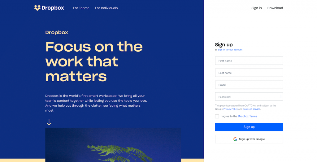
Source: Dropbox.com
Dropbox isn’t playing around. When you visit the homepage, they immediately go for the close, no beating around the bush: “Sign up.” Interestingly, the form is positioned on the right-hand side of the page, which is a natural place for a western reader’s eye to travel.
Typically, similar companies would put a short CTA and then take you to a separate sign-up page. But because Dropbox is such a recognized name within their specific niche, they can get away with going straight for the big win.
Why It’s So Effective
- Direct, no nonsense CTA
- White form contrasts the muted colors of the webpage
- Uniquely positioned on the right-hand side
Who Should Use It
If most of your website visitors land on your homepage already determined to create an account, consider putting your full sign-up form above the fold.
3. Toggl’s persona-based branding
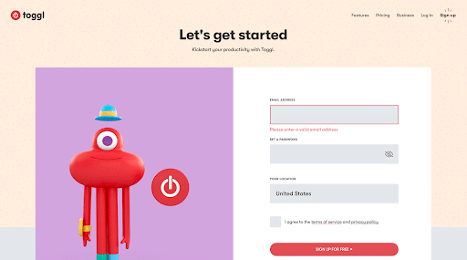
Source: Toggl.com
If you click on the simple “Sign Up” CTA on toggl’s homepage, you are taken to this lead generation form. Immediately, you’re greeted by an adorable claymation-style creature who happily presses the toggl logo (or power button) over and over again—which is perfect for their audience, who are mostly millennials faced with many distractions.
Toggl clearly knows exactly who their most qualified leads are and have adjusted their branding to cater to their aesthetic preferences and divided attention. It’s worth noting that, interestingly, the entire form does not fit above the fold, which is unusual. However, because of the animation, the visitor is inclined to scroll down to view the whole image anyway.
Why It’s So Effective
- Adorable persona-based animation
- Aesthetically pleasing complementary color pallet
- Minimal number of fields
Who Should Use It
If you have a very defined, specific audience, consider making your forms a unique branded experience. That way, you capture the eye of your intended customers (and filter out unqualified leads).
4. Airbnb’s long-form typeform-style questionnaire

Source: Airbnb.com
For the relatively new and exclusive “Host an Experience” program, Airbnb wants to collect a lot of information from prospective hosts—there’s no way around it. The truth is, they need far too many questions answered to get away with using a simple multi-step form. So, instead of giving prospects what looks like a college application, Airbnb uses a Typeform-style form.
Typeform makes multi-step questionnaires that only reveal one question at a time to minimize overwhelm. It’s a smooth, aesthetically pleasing process that assures the prospect that, yes, this is an organized process. Airbnb also integrates pictures and explanations to break up the questions and keep users engaged.
Why It’s So Effective
- Typeform-style multi-step questionnaire
- Pictures and explanations break up the questions
Who Should Use It
If you need to collect a lot of data from your leads upfront—more than just a simple mutli-step form can accommodate—consider using a Typeform-style form in order to make the experience less overwhelming.
5. Netflix’s price-first sign-up experience
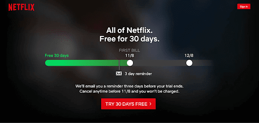
Source: Netflix.com
When you visit Netflix’s homepage, they cut right to the chase. Since you already know what Netflix is (who doesn’t?), they only need to sell you on their pricing. So, instead of pushing the benefits of their streaming service, there is a bar that represents how long your 30-day free trial would last and when your first bill would arrive, making your experience personalized and tangible.
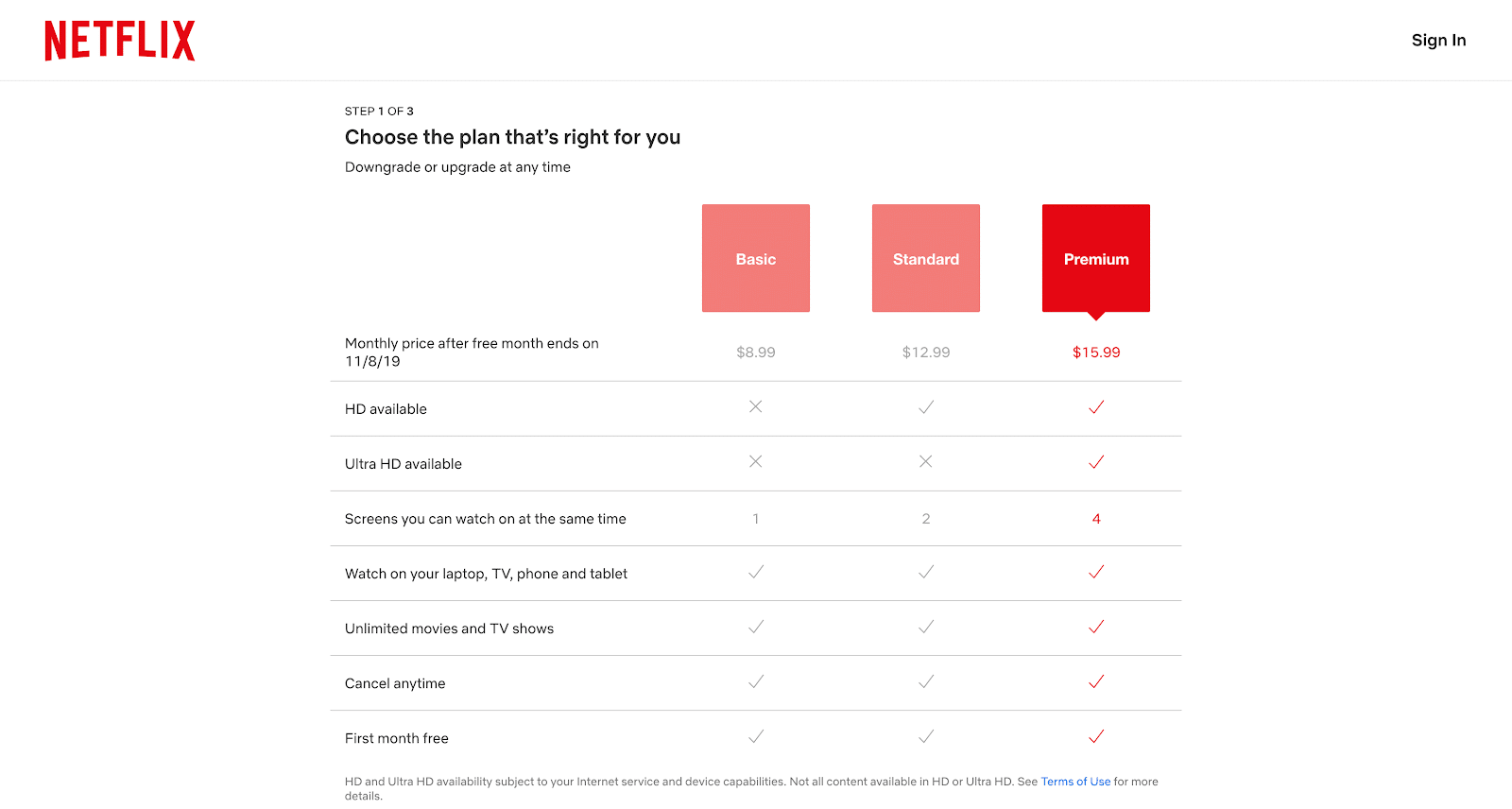
Source: Netflix.com
While most companies get to pricing at the end of their form flow, Netflix immediately guides the prospect through a multi-step questionnaire on its own landing page, which includes an easy-to-read chart to explain their pricing tiers.
Why It’s So Effective
- Powerful CTA that visually demonstrates how long until a prospect will pay
- Embeds the pricing clearly in the early stages of the sign-up process
- Clearly labeled steps (e.g., step 1 of 3)
Who Should Use It
If you have a well-known offering that’s already at the top of your niche, consider putting your pricing first. Your prospects already know what you can do for them—all that’s left to do is sell them on the price.
6. Lucy & Yak’s exit-intent lightbox form
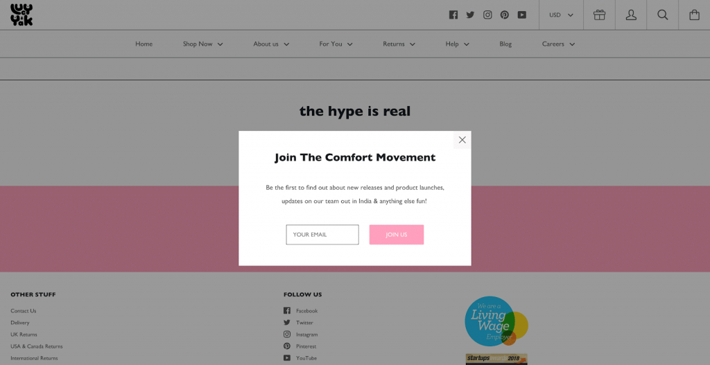
Source: lucyandyak.com
If you visit Lucy & Yak’s website and move your cursor towards the back or exit button, you are presented with a lightbox pop-up inviting you to “Join the Comfort Movement.”
Despite many people’s gut feelings towards pop-ups, you see them so often for one reason: they’re effective. Since Lucy & Yak is trying to catch you on your way out the door, they cleverly keep their ask to a minimum with only one simple field.
Why It’s So Effective
- Exit-intent is a great last-ditch effort to capture prospects before they leave your page
- Pop-ups are proven to be effective
- Keeping it simple makes the pop-up minimally intrusive
Who Should Use It
Exit-intent lightboxes can be used in combination with any of the other forms here. If you’re seeing a higher-than-average bounce rate on your page (people leaving your pages or forms incompleted), consider implementing this “last chance” strategy.
7. Mailchimp’s multiple form flows
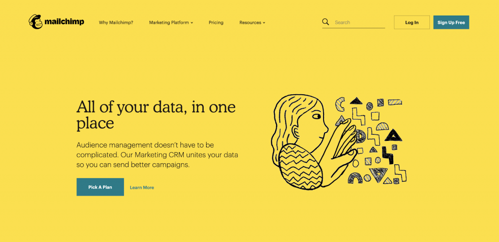
Source: Mailchimp.com
Mailchimp is known for their impressive, industry standard-setting branding guidelines—and of course Freddie, their iconic monkey mascot. Naturally, their current homepage puts their personality front and center with a quirky animation and interesting color choice.

Source: Mailchimp.com
If you opt to “Pick a Plan,” you’re taken to a tiered pricing chart, and then a sign-up sheet. The sign-up sheet itself is notably plain—no frills at all, aside from a winking Freddie. The whole experience is extremely appealing because, at every step of the way, it’s clear that Mailchimp knows exactly who they are and what they’re trying to accomplish.
Why It’s So Effective
- Two separate form flows (“sign up free” and “pick a plan”)
- Thoughtfully branded experience from end to end
- Starkly simple sign-up sheet with minimal fields
- Intriguing animation in a unique artistic style
Who Should Use It
If you offer a free version of your service, consider designing two form flows: one for free users and one for paid. That way, each form can cut to the chase more quickly—paid users get to see a tiered pricing chart immediately, while free users get to dive right in.
8. AND CO’s social proof-based form
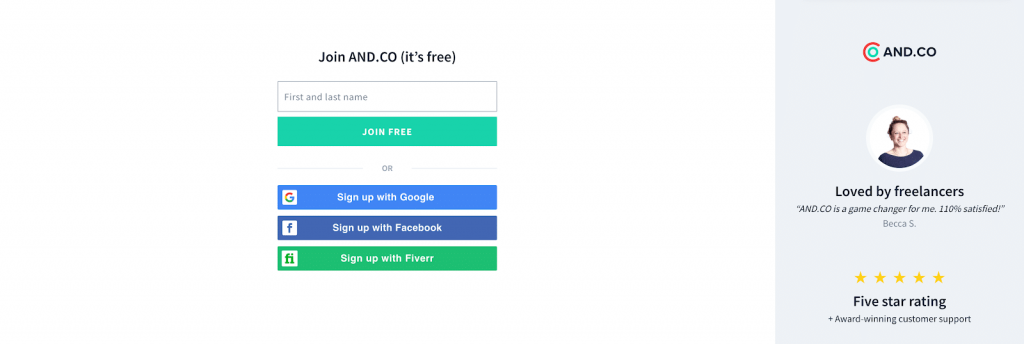
Source: and.co
Since AND CO is a relatively new company to the invoicing and expense-tracking space, you probably haven’t heard of them before. To counteract this, they put a lot of social proof front and center. If you click the “Start Now” CTA on AND CO’s homepage, you’re directed to an incredibly simple sign-up landing page. The only branding is in the short testimonial and social proof on the right hand side.
To keep your attention on the social proof, AND CO makes the rest of the sign-up process as easy as possible—if f you don’t want to just give your email address, you can sign in through Google, Facebook, or Fiverr with a single click.
Why It’s So Effective
- Social proof
- Single-click sign-up page
- Extremely clean landing page
Who Should Use It
If you’re a relatively new company within a niche, consider adding social proof to your forms. Even just a few positive reviews can go a long way!
9. Optimizely’s two-column pop-up
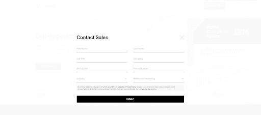
Source: Optimizely.com
Optimizely needs eight fields worth of information from their prospects, which definitely puts it on the longer end of the spectrum. However, by dividing the questions into two-columns (and making it resemble a short notecard), the eye is tricked into thinking there are fewer questions.
Additionally, when the black and white pop-up appears, the homepage is faded to the point that it’s nearly invisible, focusing the prospect entirely on the form.
Why It’s So Effective
- Fades out the background to near invisibility
- Two-column style
- Simple black and white color scheme
Who Should Use It
If you need to collect more than four fields-worth of data but don’t quite need enough information to justify a full-blown multi-step process, consider a two-columned form. Just bear in mind that it should all be above the fold.
10. Grammarly’s demo and free account sign-up

Source: Grammarly.com
Grammarly’s homepage has it all—social proof, a clear CTA, tight headlines, and—most clever of all—an animated demo of their software in action. An animation on the homepage shows users exactly what they can expect from the software, demonstrating how intuitive and easy to use it is.

Source: Grammarly.com
If you click the free trial, you’re taken to a clean multi-step form that tracks your progress along the bottom. Here, you’re reminded again that the account is free, given several other sign-up options through Facebook and Google, and presented with one field at a time.
Why It’s So Effective
- Software demonstration animation
- One field is seen at a time
- Progress tracked along the bottom of the form
Who Should Use It
If you’re offering software that looks impressive in action—or that’s difficult to explain—consider adding an animated demo to your form. For a prospect, checking out a short animation is a lot less daunting than settling in to watch a full demo video.
Conclusion
By optimizing your lead generation forms, you can increase conversions by a significant percentage. Since shorter forms convert at a much higher rate, collect the bare minimum and then fill out the rest of the lead’s profile using data enrichment tools. Get started by browsing some data enrichment tools to see if real-time or post-submission enrichment is best for you!